


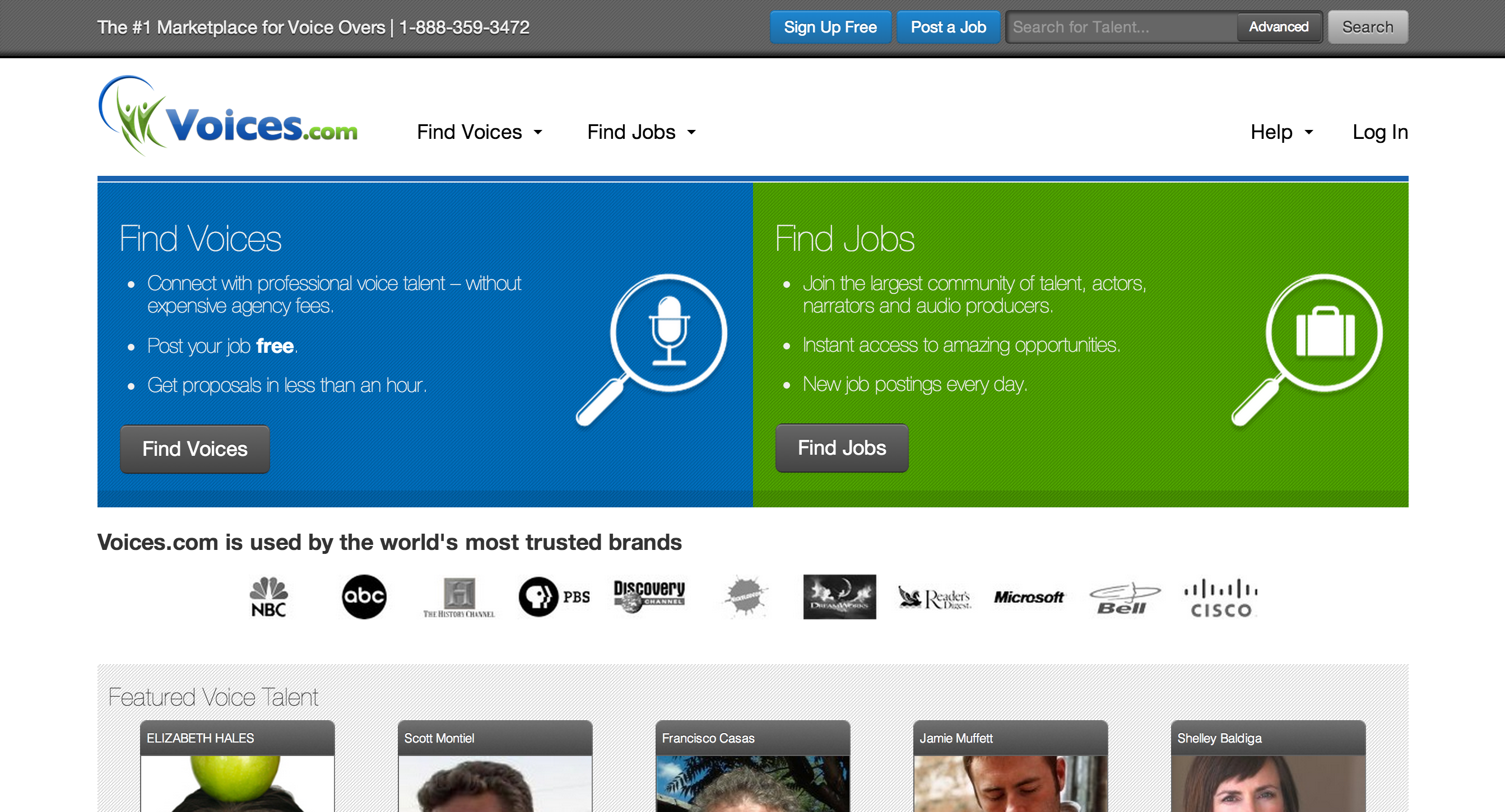
After graduating from the Ontario Institute of Audio Recording Technology, I opened a small recording studio. In effect, I became a freelance audio producer. I started to notice a number of freelance voice talent would contact me and ask if I had any connections to jobs. I asked myself: “What if I transformed my brochure-style website into an online marketplace that connected freelance voice talent with the clients who needed to hire them?” Thus, Voices.com was born, and today, we serve 250,000 users from around the world.
As the site continued to scale, me and my team realized we wanted to focus on mobile because that’s where traffic was coming from. Our goal was to cost-effectively deliver consistent user experiences on all devices and platforms, as well as position the company to meet future demands.
We sought to answer the question: how do we hack our way to a better experience? And how could we do that while focusing on our design philosophy, built on three elements: growth, focus and innovation?
Step 1: Conducting Research
With 85 percent of mobile site visitors skipping through to visit the full site it was evident that we needed to offer more mobile functionality. We’d previously created mobile apps, but eventually circled back to the mobile Web because we wanted to offer full functionality in a website that would meet the needs of our global audience.
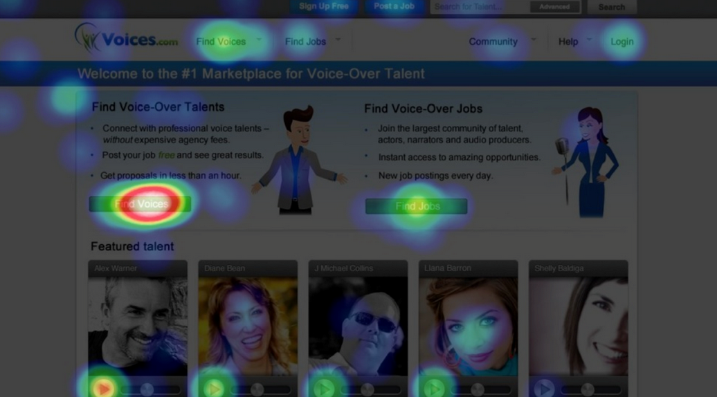
We knew that a successful redesign needed to keep the best of what Voices.com already had to offer. To ensure this, we surveyed our customers and also deployed Crazy Egg, a heat map application that counted clicks on a page-by-page basis. This data created a heat map which identified the areas where our users were clicking, likely the areas of the website that interested them most. These formed the basis for deciding which features were kept and which were soon to be eliminated from a mobile version of our website.
As part of the pre-project phase, I did a lot of reading. Notably, two books stood out: “Mobile First” by Luke Wroblewski and “Responsive Web Design” by Ethan Marcotte. It’s in these books that I was introduced to the concepts of taking a mobile first approach to design, by eliminating all but the essential features and elements on a page or screen. This mindset inspired the team to focus on the critical few features that would enable us to offer an amazing user experience.
Step 2: Getting started
With essential features in hand, we created a Mind Map diagram to visually outline information: in this case, the various screens in the application. Each branch in the mind map represented a screen within the application. The map served as checklist of which pages needed to be designed, developed and tested. It’s been our secret for ensuring a consistent user experience across our brand.
As tech-savvy as I’d like to think I am, I’ve found that it’s often fastest to get ideas down on paper using a technique called paper prototyping. Essentially, this means drawing in elements of your experience using a pencil. I even resort to using a Sharpie because they are big and thick and force me to mock-up the big elements and not focus too heavily on the details. With a few screens drawn on paper, I then present the paper to a colleague and ask “Where would you touch to login?” or “You want to do a search, where would you touch?” If they get it right, then present them with the next page which represents the next screen in the workflow.
Paper prototyping is like doing a storyboard for a movie, but it’s a storyboard for your app and it allows you to get very early feedback on the workflow without spending hours designing.
Step 3: Execution
We chose to work with Adobe Creative Cloud because we could use various task-specific tools to get our project done.
To start, we used Edge Reflow and were pleased with how it helped us easily understand and apply the principles of responsive design. Probably the most interesting part of the process was gaining an understanding of the best practices for breakpoints. The grid approach, where every screen had 12 vertical columns, enabled us to standardize the look and feel of the site across devices. For example, we were able to be consistent with the sidebar menu widths. We were also able to take into account factors such as screen resolutions and pixel widths for various designs, which were fundamental to figuring out how the site would behave on different devices. From an efficiency perspective, use of Edge Reflow resulted in a faster quality assurance process. It also reduced support and overhead for a leaner, more collaborative design and development team, less outsourcing of separate native development efforts, and a reduction in code and domain maintenance costs over time.
We also established product specifications and built wireframes of every page using Photoshop. A single template served as the basis for three separate files–phone, desktop, and tablet. Initial layouts were designed in Photoshop, making extensive use of shared assets while creating layers for each of the three files. To help speed page loading, the team also used Photoshop to create CSS sprites for icons. Seeing where images would drop in and out on a page forced us to make tough decisions about which images worked, and which ones should be removed altogether.
To speed loading times even more, we included Sprites in the CSS file that we created. So instead of having 87 files with all different icons, we had one file with all of the icons and only showed the ones that were necessary for the page. The browser can cache the one file so it doesn’t need to keep loading individual files. The discipline of creating Sprites also encouraged us to standardize the look and feel of the icons and keep them limited to just the ones we were using. After we had our proof of concept, we rebuilt the entire site from scratch using Dreamweaver. Overall, we realized considerable time and resource savings with our responsive web design approach, and were able to eliminate lines and lines of code that we weren’t using.
Step 4: Testing
With the new skin applied to all the pages on our website, we commenced the testing phase. The team created a shared Google Spreadsheet with a list of featured down the side and all the browsers that we’d be supporting across the top. Every page was tested in each browser and received a “Pass” or “Fail” – which we detailed on our blog.
Step 5: Continuing to iterate
Now that we have responsive concept down, we’re working on trimming the site down as much as possible to maximize reach. But I’m proud of what we’ve accomplished: since the launch of our redesigned site, we’ve seen a 17 percent increase in how long our members stay because of the consistent experience delivered regardless of device. Plus, our mobile traffic has increased 43 percent year over year, and membership logins have increased at 86 percent.
That being said, there’s still continuous designing and building to do – but by following a clear pathway every time, your users and team will thank you.